The story of a resilient website
Nutriversum food supplement company (B2C)
-
Client
NUTRIVERSUM
-
Industry
FAST MOVING CONSUMER GOODS (FMCG)
-
Service
UX/UI DESIGN
-
Team Setup
ME + RESEARCHER + SEO EXPERT + DEV TEAM
-
Timeline
5 months
Context
The start
By 2022, Nutriversum changed its outdated branding and needed a new website to match—with a special focus on the mobile experience because many people shop on their phones.
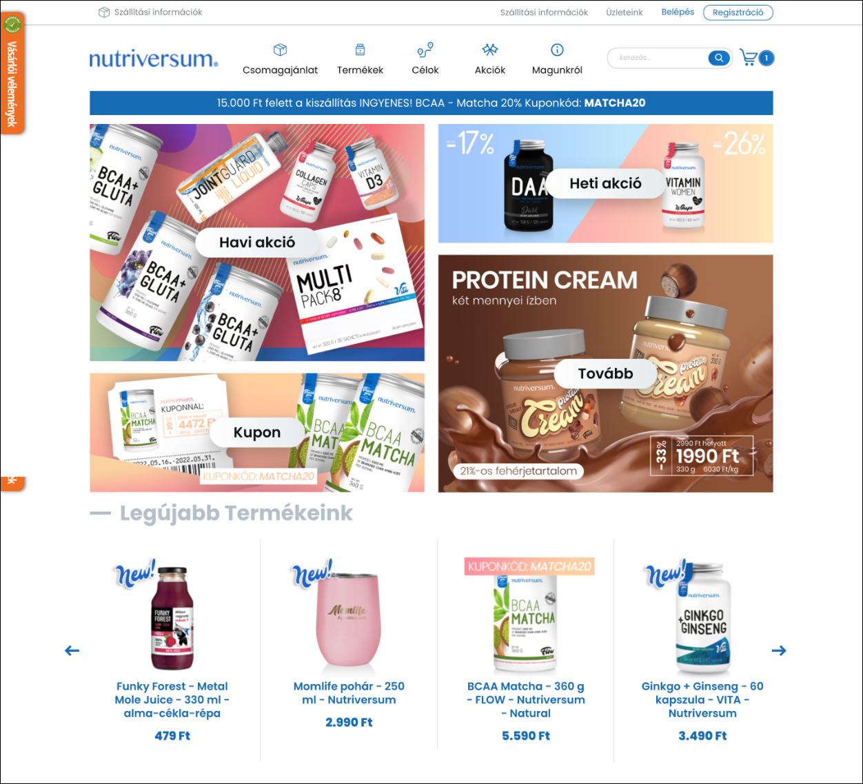
Screen from the old design.
Take with a grain of salt,
what the famous painter told:
Steal design to become good, shine like stars in Hollywood.
But to become like Picasso,
"steal from bigs” is not good motto.
Challenge
I began this project with over-optimism. Even though it was my first complex e-commerce redesign, I saw it as a field rich with patterns from major brands.
Driven by curiosity, I set out to understand what makes a user experience truly seamless.
Along the way, I realized even top companies often stumble, especially at the final step: order confirmation. Many fail to clearly tell users what happens next, leaving them uncertain whether they should expect an email, keep the page open, or take a screenshot just in case.
Bigs’ practices are not best practices
I soon realized that B2C e-commerce is a field in high need of UX improvements—it’s filled with patterns that don’t actually support good usability.
My goal was to prove that a small European brand can get it right
My contribution
Fixing the bad, yet famous patterns
When crafting the low-fidelity designs, my main goal was to create an experience free from the mistakes that even big brands make.
On a project management level, this meant helping the client understand that long-term success comes from a well-thought-out user experience, not from flashy graphical elements. And that takes time—because existing patterns need to be challenged and refined during the redesign.
So, we prioritized spending more time on usability and flow and less on visual embellishments—which were just the cherry on top.
This required active collaboration with the development team. Since parts of the purchasing journey were built on e-commerce templates (Magento, Hyva), I had to assess the constraints they imposed. When these constraints resulted in significant usability friction, we evaluated the effort required to change them.
Through this collaborative approach, we found the balance between good usability and efficient use of development resources.
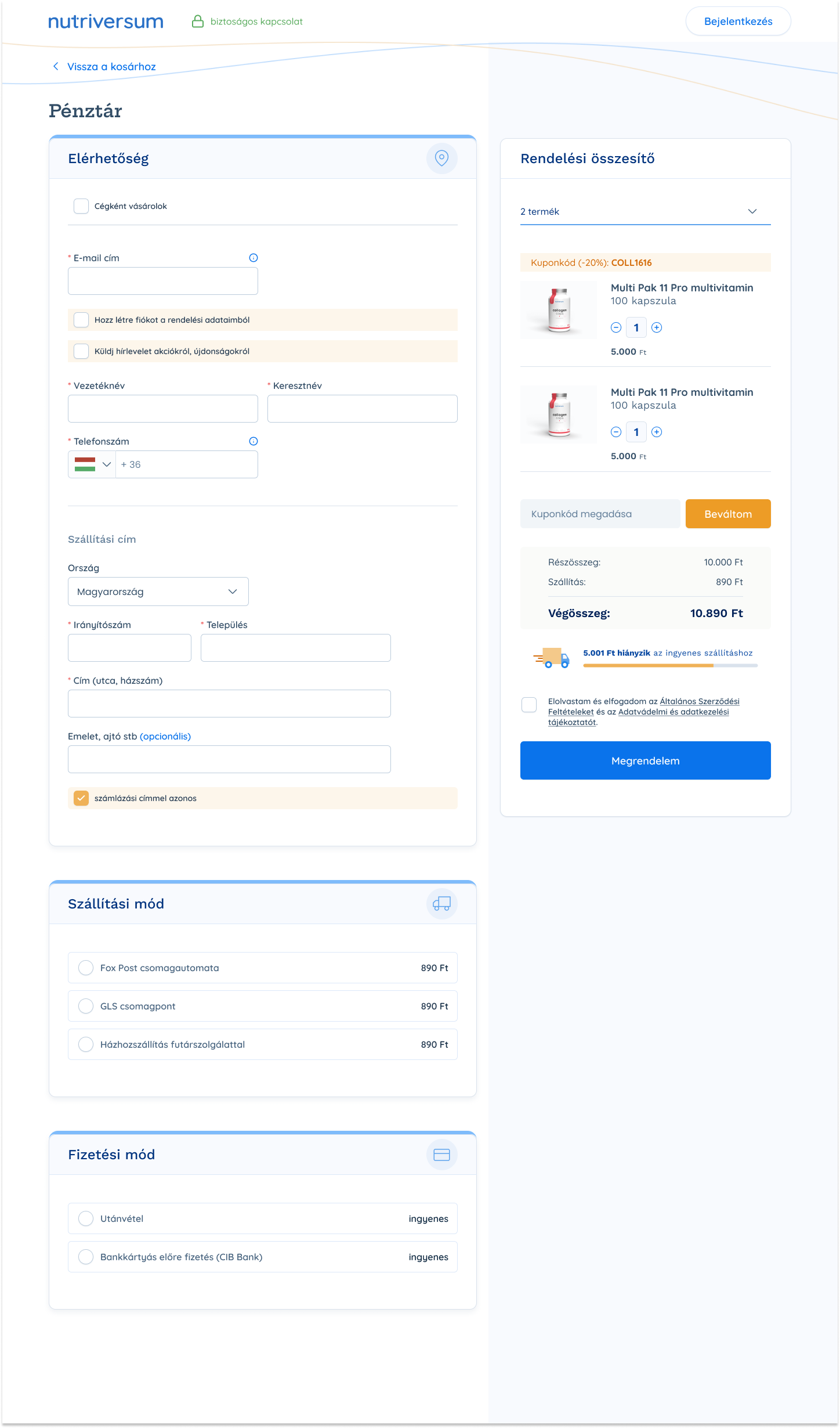
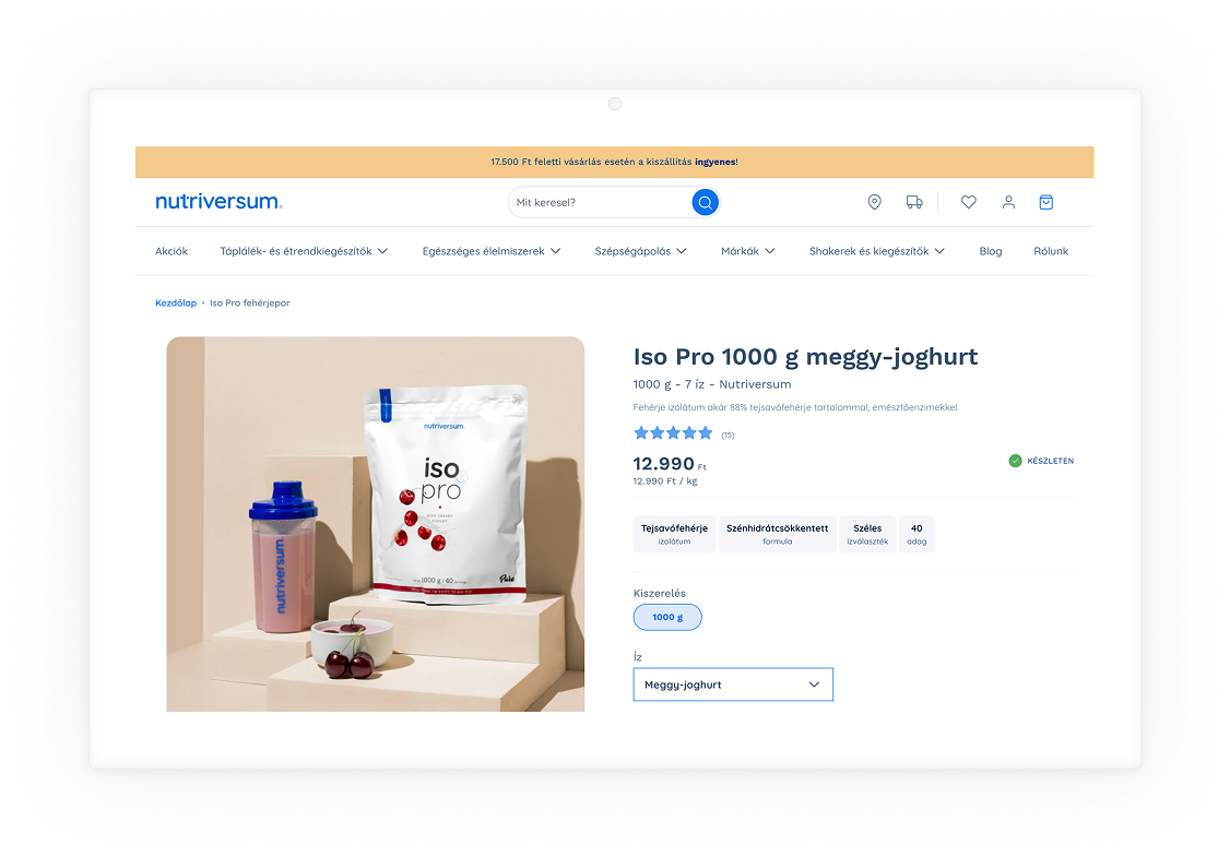
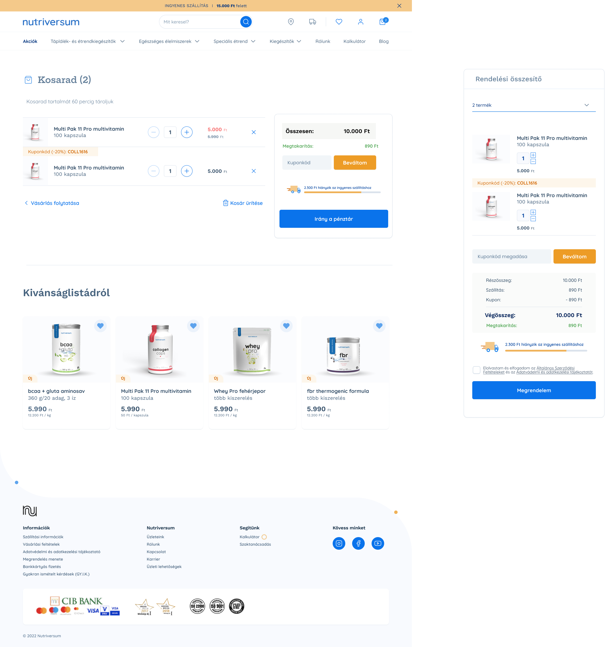
Screen from the payment flow (made with active designer-developer collaboration)
My contribution
Ensuring accurate implementation
It wasn't enough to know which mistakes to avoid; it was equally important to ensure the development team didn’t fall back on well-known practices when they seemed easier to execute.
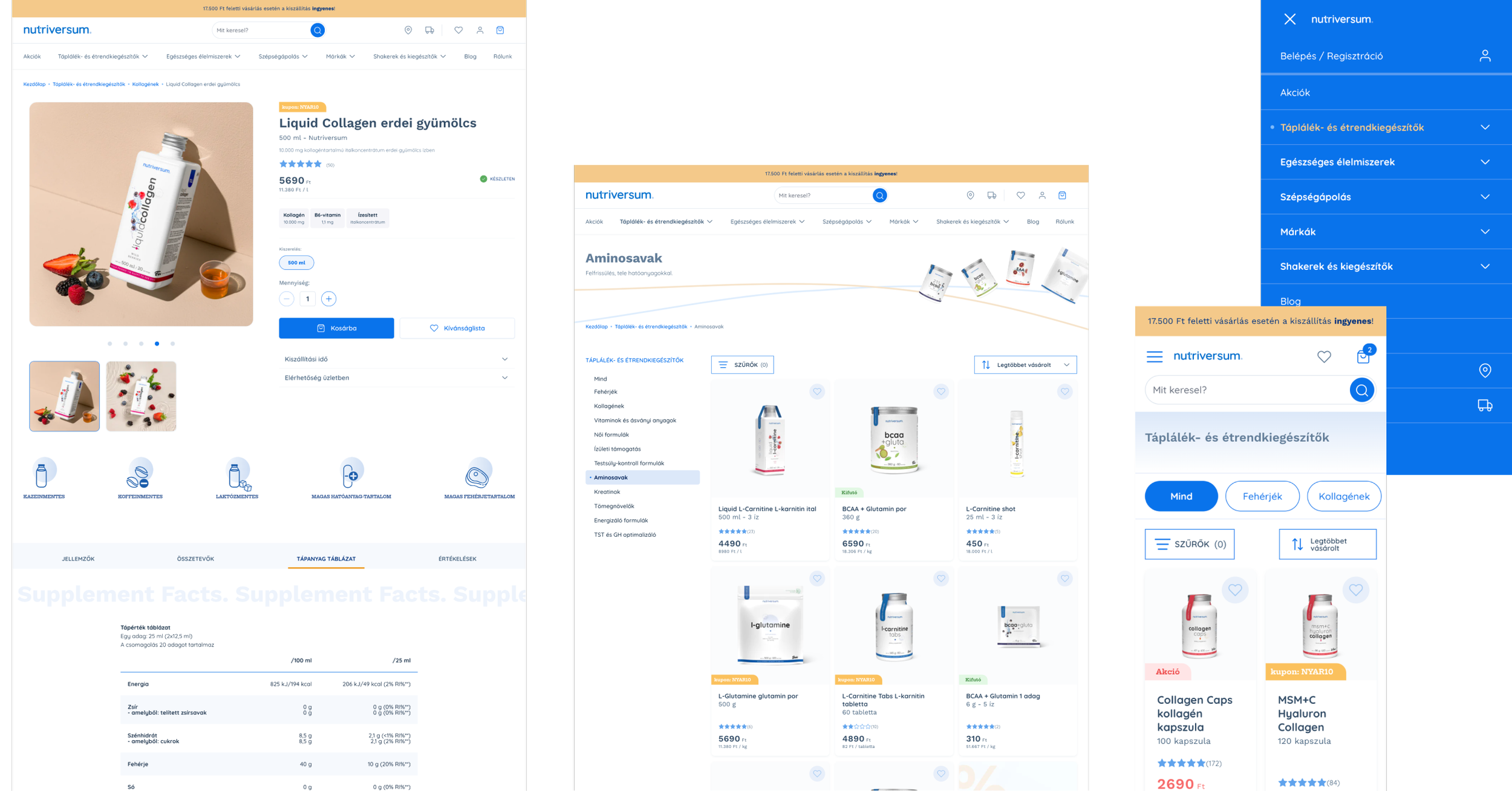
To achieve this, I created precise, detailed screen flows that left no room for guesswork. I added annotations to explain why each element should be executed in a specific way—especially for mobile, where most of the traffic occurred.
Doing this required me to create a comprehensive UI kit that covered all the variations of design elements needed for those flows.
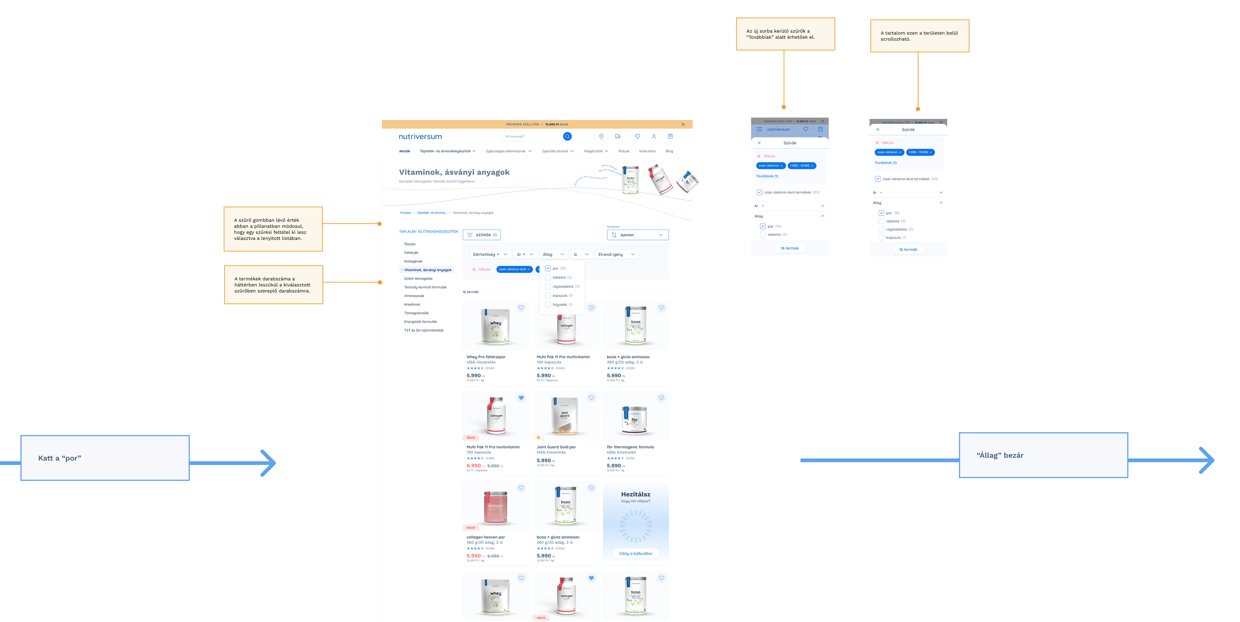
Part of an annotated screen-flow.
My contribution
Balancing with the aesthetics
The Nutriversum products are designed to support various health goals, regardless of gender or age.
From a design perspective, I understood it as guidance to find a balance in the visuals that make more ages and genders feel comfortable—while aligning with the new brand guidelines.
This led us to a natural, yet friendly and playful design.
Outcome
A market-resistant solution
I delivered a design that supports people with clear navigation, adequate information, and a smooth purchasing experience—ensuring that they can spend their money wisely.
But it also supported the company. Despite the economic downturn, they retained their user base, and customer feedback on the new experience has been overwhelmingly positive.
Moreover, the final design won the High Quality Prize in the E-commerce category at the Hungarian Market Association’s annual Websites of the Year 2023 award.
This award recognizes Hungarian websites that set a high standard in design, user experience, and content quality.