Impacting millions through a complex ecosystem
United Nation’s humanitarian organization

-
Client
WORLD FOOD PROGRAMME (WFP)
-
Industry
HUMANITARIAN AID
-
Service
UX/UI DESIGN
-
Team Setup
ME + DATA ANALYST + PM + DEV TEAM
-
Timeline
1.5 year
Context
The humanitarian activity
The World Food Programme (WFP) is the food assistance branch of the United Nations (UN).
It provides emergency food aid, combats hunger, and works to improve nutrition and food security globally. WFP operates in over 80 countries, assisting people affected by conflict, disasters, and poverty—such as those impacted by the war in Ukraine.
To deliver assistance, WFP collaborates with private sector partners. The more partnerships they form, the more people they can reach globally.
Partners are invited to register on a dedicated platform, which is used to manage the administrative side of the collaboration.
Note to the reader: limited amount of screens due to sensitivity of information

It’s not wrapped in ribbons, no glitter, no gloss.
But don’t get it twisted, it still runs the boss.
No need for lipstick, no fake little fix,
It handles its business, no need for the tricks. Not built for the runway, not made just to shine.
But give it a task—and it handles just fine.
My contribution
Helping to build more partnerships
Data showed that a high number of potential partners left the site without registering. As the sole designer on the project, my task was to improve conversion. With no prior user research and limited resources, I proposed interviews, but they weren’t feasible.
Working within these constraints, I identified two key issues:
Visual trust – Drawing from my legal research background, I knew that if look and feel don’t reflect an organizational connection, users may not perceive one. The portal’s content and visuals didn’t resemble a UN site, potentially undermining trust and credibility.
Lack of risk–reward clarity – Potential partners lacked enough information to understand how demanding the administrative process would be (risk) for the value of becoming an official partner (reward).
Building trust through aligned visuals and providing clear information about the expected administrative effort led to an increase in actual partnerships.


Partner Connect homepage before and after
My contribution
Helping to maintain partnerships
For the WFP, acquiring new partners isn’t enough; these partnerships must be maintained long-term. To this, the key is a smooth, user-friendly system that streamlines the end-to-end administration of the support process. And this became my responsibility when joining the team.
With my contributions, the humanitarian organization was able to optimize and extend its reporting system for partners. This required close, day-to-day collaboration with the internal team.
Working with a complex platform, robust backend integrations, and a layered ecosystem left little time for onboarding. I had to quickly piece things together, filtering what mattered for design decisions—because the stakes were high: secure private sector support.
To that, I had to ensure the design worked not just on a couch, but also in the field, under the sun, on a small phone, with tired hands. This meant eye-friendly light colors and data tables that were easy to navigate even on small screens.


Partner Connect reporting module screens

My contribution
Building financial transparency
The most challenging part of the reporting system was designing a finance module to show partners when they’d be reimbursed for pre-financed humanitarian costs. I had to do this within the constraints of an in-progress design system, aligning complex workflows with an evolving component library—requiring close collaboration with the design system team.
The goal was to ensure partners could immediately understand, at a glance, what stage their invoice was in and what would happen next if issues arose.
I led the effort to align the interface with real-world terminology to reduce confusion and minimize the learning curve. Although the team initially preferred a generic, templated design, I successfully advocated for using terminology that reflected how users actually understand the delivery tracking progress. I conducted workshops, reviewed internal data, and led user sessions to guide this alignment.
Because no matter how polished the UI is, partners will still call WFP if, for example, they see “Finalized” instead of the familiar “Processed” — which, to them, means ready to pay. More confusion leads to more support calls, and ultimately, more staff needed to handle them.

Bridge Design System templates
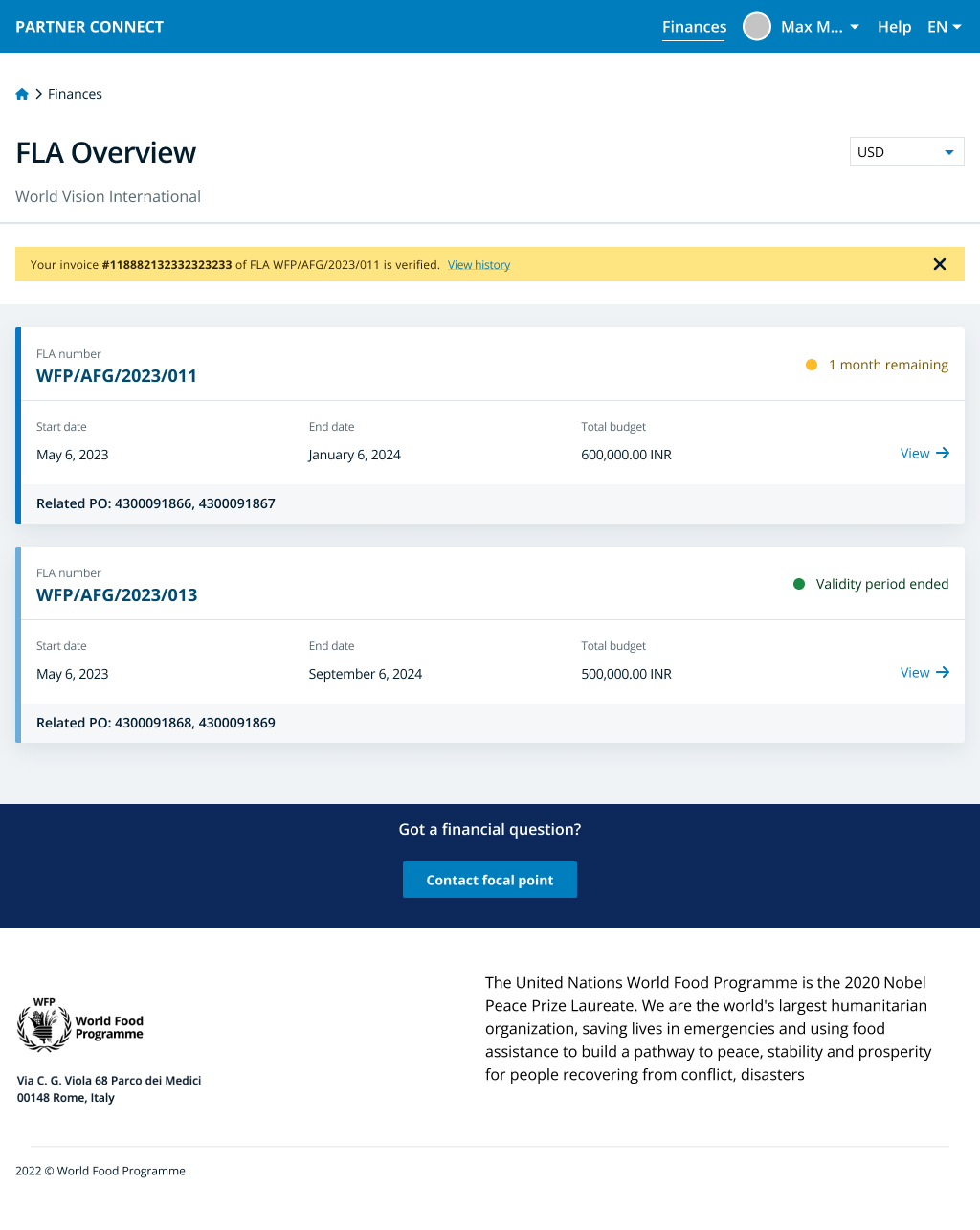

Partner Connect finance module screens

My contribution
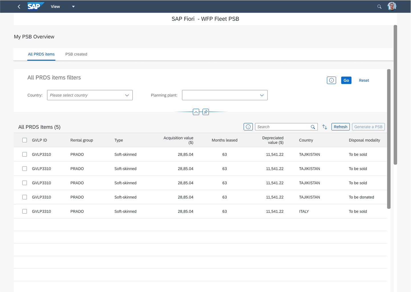
Helping efficient asset utilization
WFP also aims to optimize resources and reduce waste by properly managing and disposing of obsolete assets, such as equipment, vehicles, or buildings. It requires a multi-level approval process.
My task was to finalize the design of the asset disposal process using the SAP Fiori Design System, creating a standardized digital workflow to track approvals and reduce costs.
Since the target audience had very low tech maturity, the interface needed to ensure familiarity not just in terms of process, but also visually (e.g., keeping most content visible).
As a result, the final design was not “by the book,” but it was definitely the best solution for the users and a strong example of applying the “I am not the target audience” approach.

SAP Fiori Design System templates


Property disposal platform screens
My contribution
Helping reach millions in need
With my contributions, WFP was able not only to optimize and further develop its reporting system for partners, but also replace its manual, paper-based asset disposal process with a digitized workflow.
At the end of the day, this isn’t just about better systems. It means more efficiency, more saved resources, and ultimately, more food reaching millions of people in need around the world.

Sometimes not going by the book is the key to a well-functioning design
My contribution
Going even further with resource optimisation
With proper planning, WFP can ensure safer travel while reducing costs—saving money through smarter operations.
After a successful earlier collaboration, I was brought in to design a third layer of resource optimization: effective planning and preparation for WFP personnel traveling to high-risk areas.
The solution had to integrate multiple travel tools and was developed closely with the travel management team, including a service designer.
The resulting Travel Hub offered a clear planning overview, separating mandatory from optional actions, and allowing users to complete all key steps—like booking flights and accommodation—in one place.
Delivered by the end of 2024, the design became even more valuable as UN funding was reduced by Trump administration, making cost-efficiency critical.


Travel Hub screens